UPDATE: I will shortly automate this with a google sheet and possibly data studio. Stay tuned.
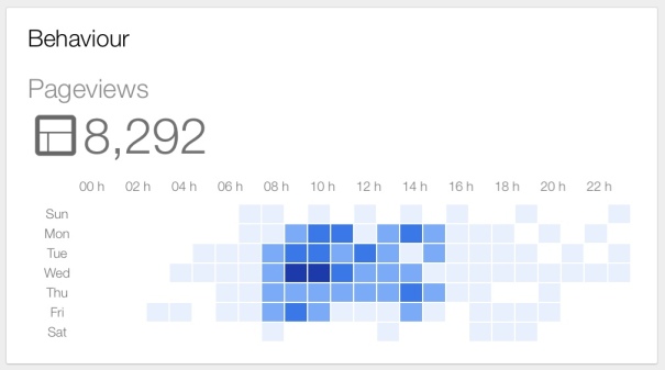
A quick post inspired by the new Analytics App (iPad), in particular the “Behaviour” pageviews by day and hour chart
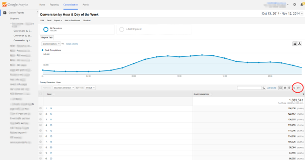
After seeing the above and then seeing/ playing with a great customized report from Kiss Metrics, written by Griffin Roer (see report 2), I thought what a great way to provide some real in-depth insights based on goal completions.
Following on from the post (and downloading the customized report) you just need to follow the simple steps below to get a working excel alternative.
Open the report
Click on the pivot option (right hand side) and then select “pivot by: day of the week name” (just by the secondary dimension button)
First thing to do is expand to 25 rows (i.e. all the hours in the day)
Switch order of Hour to 0-23
Now you can’t export this like other tables into Excel. We have to highlight the data and then copy and paste
Remember day 2 days will be on another page so make sure you include them
Open Excel
Open a blank spreadsheet
Paste in the data (paste by “match destination formatting”)
Strip data down by removing un-necessary row/ columns
Re-order them Sun-Sat or whatever fits your profile
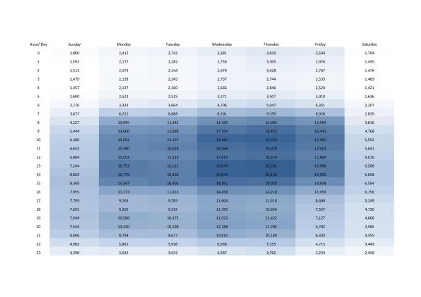
Now select all the cells with values, click “conditional formatting” from the ribbon, and then select color styles. (Pick a style)
As I wanted white to blue, I selected “more rules”, changed format style to 3-color scale and amended the colors.
Some final adjustments to fonts, alignment, cell width and cell height was needed to get this fitting nicely to one page.
Attached is an example “website goal completions by hour and day of week” to takeaway
Get more insightful
This is the real beauty of this report, think beyond aggregated goal completions. By editing the report “metric goal” to individual goal completions, you will now see different patterns per goal.
Segment/ filter it by device to see differences in desktop and mobile devices.
Segment/ filter by a location, by browser, by pages, by user loyalty… the list is endless
Or even better by a custom variable, something that gives you real insights. For us, our customer variable is personas driven by sign up data. We can now see the differences in our personas and when they achieve their goals.
Knowing insights like this we can tailor our digital offering accordingly.


Leave a comment