
I’ve spent some time recently on user journeys and thought I’d share some best practice. User journey mapping isn’t something new, it is something fundamental when understanding your user.
It can help provide insights for design improvements or IA changes.
Just to clarify, today I’m talking about the digital user journey either on the web or an app. It is though extremely important for a lot of services to map the entire user journey, online, offline, before and after.
strip the data of terminology and focus on what’s important
Quite often we have built a site and it’s navigation to the way we expect people to use it. (To get to page C they must see page A first and then page B, but often that isn’t the case. Visualising user journeys can help all parties (stakeholders, designers, developers, content owners and senior management) see the reality.
Google Analytics, in particular, navigation summary and entrance pages, can paint this picture and this is were we will get the data from. The key though is to present this out of GA, strip the data of terminology and focus on what’s important.
I have used a hierarchical approach when drawing the journey, expanding each element where appropriate. I just use percentages and often group pages together by function (navigation links, menu link, content links) or by whats relevant to the journey you are painting.
We start in the middle, write down the name of the page. Surrounding this we will document the initial 4 journeys to/ from the page which comes direct from the navigation summary in GA; that being entrances and previous page for ways to get to the page and then exits and next pages when leaving the page.
Google Analytics Navigation Summary
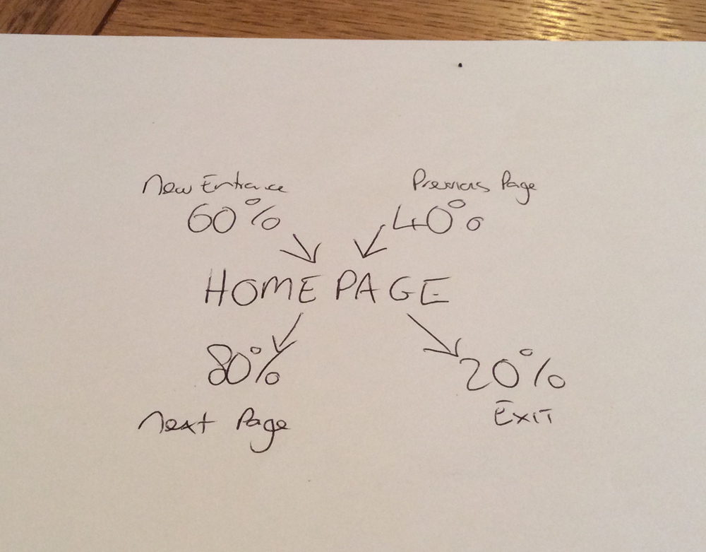
Hand drawn user journey
The percentages in the GA report are sessions, but just keep the percentage.
Next let’s look at entrances and in particular medium. To get this go to landing pages for your particular page. Use medium as a secondary dimension. Note the medium and the percentage in grey. You might want to start to group the lesser values into “other”.
Next step is to take this up a level. Change medium to source/medium and expand the report. For each medium, now get the percentage split of sources. This is best using the advanced search feature and then again note the source and percentage in grey. For the example below I have expanded organic and referral as they are the key entrances for me.
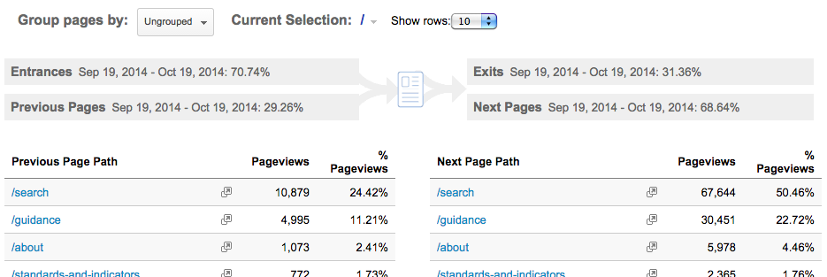
Now let’s look as previous pages. Expand the navigation summary to 500 and export to xlsx. This report is based on pageviews, but we are only bothered about percentages. You can do this two ways, either convert the export to percentages (total pageviews is at the bottom of the report, not the pageviews from the page metrics) or you can let excel charts convert to percentages for you.
The key here is to group the pages into logical groups. These could be related vs non-related pages, split by function (navigation, body, breadcrumb, search etc) or by IA.
Repeat this for next pages, but I would advise you first split by related/ non-related to focus the mind. If search is a next page you can split this again by keywords used. Remember group by what is key to you.
Exits is normally just a percentage, however sometimes if you use event tracking for exits or own sister sites you can split exits by known/ unknown. Again take it on a step and split known.
Now you should have a full one page user journey as per below. But the reality is, it isn’t full. All it shows is how people got to one page and how they left one page.
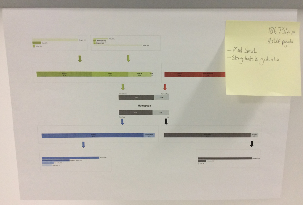
Single user Journeys on the wall
We need to grow this to more pages, pages that are related and are key next pages from the original page. Now continue this like a family tree.
bring focus to journeys
With all the pages, print them out A3 and build the journeys on the wall. Note the links that bring this together whether that’s downwards or side wards.
The final step is to bring some focus to the journeys. Using post-it’s add detail. You could add pageviews to each A3, but pageviews are a nice to know metric not an insightful metric, however I suggest you use page value driven from site goals. If you don’t have goals set, set some! Goals I have used are people who downloaded, people who shared, people who added comments, people who signed up etc. adding page value paints a better picture of what journey provides your true users or potential users.
I have used an excel model to help visualise (or if your handwriting is better than mine just use a pen and paper). Once you have done this a few times it won’t take long to create journeys fitting in perfectly with AGILE UX processes.
Put it on paper, A3 preferred, and get it on a wall!

User Journeys on the wall


Leave a comment